
+ a shop of nordic style furnitures and objects for your home, and body care products +
+ a team of girl designers +
+ a small coworking +
+ creative workshops, with a hand made inspiration +


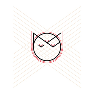
Minoop is founded on a simple yet refined concept: creating a beautiful space where you can truly feel at home. Carefully selected elements form the foundation of this concept. The iconic logo, designed for easy adaptability to various formats, serves as the cornerstone of the brand.
The original team, consisting of three talented women with diverse design skills, is symbolized by three downward-facing triangles, representing femininity. The circle, a primal symbol of harmony, reflects the shape of our home, Earth. Through the exploration of these three shapes, a delightful surprise emerged—a cat face. Cats, known as the perfect companions, are believed to harmonize the energy of a house by absorbing negativity. Additionally, the Italian word for a cat, Minù, bears a striking resemblance to Minoop, strengthening the brand and making it more memorable.
"Minoop's purpose is to nurture daily joys by rekindling an appreciation for the little things. And what could be more familiar than one's own home? Our mission is to bestow well-being upon you by transforming your living spaces.
How do we achieve this? Through meticulous design, thoughtful furnishings, and a curated selection of products that prioritize your comfort. Moreover, we aim to foster connections among people. We declutter homes, ridding them of unnecessary belongings, and then fill them with items of true value to each individual."


